How to Rank Number One on Google
How to Rank NUMBER ONE (#1) on GOOGLE | BizcaBOOM The goal of getting to the top of Google’s number one search results is something


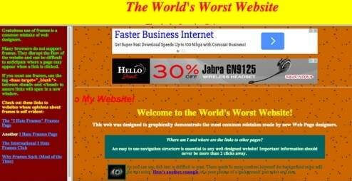
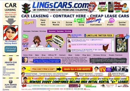
How to Rank NUMBER ONE (#1) on GOOGLE | BizcaBOOM The goal of getting to the top of Google’s number one search results is something

How to Choose the Right Keywords for SEO Purposes | BizcaBOOM One of the most critical aspects of good search engine optimization is choosing the

Is SEO Better than Google Ads? SEO vs Google Ads Many businesses use marketing techniques such as search engine optimization (SEO) and Google Ads to
How to Rank NUMBER ONE (#1) on GOOGLE | BizcaBOOM The goal of getting to the top of Google’s number one search results is something
How to Choose the Right Keywords for SEO Purposes | BizcaBOOM One of the most critical aspects of good search engine optimization is choosing the
Is SEO Better than Google Ads? SEO vs Google Ads Many businesses use marketing techniques such as search engine optimization (SEO) and Google Ads to